
Transforming Prevention Case Management Portal through Human-Centered Design
A large public sector agency sought to improve how its caseworkers manage and understand the needs of individuals and families seeking preventative services. The agency partnered with Deloitte to leverage Human-Centered Design (HCD) principles and redesign its digital prevention system. The goal was to simplify workflows, ensure holistic documentation of client stories, and streamline access to supportive resources.
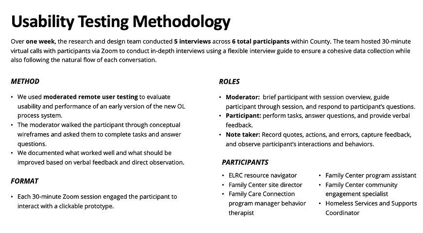
Project Overview
Industry: Public Sector – Human Services / Prevention Services
Project Timeline: 8 weeks (from discovery through prototype to usability validation)
Practices: Deloitte GPS — Human-Centered Design (HCD), Digital Transformation, User Experience Strategy
Role: Human Centered- Designer (Facilitation of user research, interactive workshops, UX/UI design, and iterative user testing )
Team: Worked closely with a Service Designer, Senior UX/UI Designer, Business Analyst and Application Manager
Key user goals anchored the project:
-
Quickly search and retrieve records of individuals or families.
-
Understand each case’s history, contact information, needs, and interests at a glance.
-
Document case details holistically for richer context.
-
Facilitate referrals and connections to relevant resources such as housing or family support programs.
Human - Centered Design Approach

The team employed a structured HCD methodology, progressing through the stages of Discovery, Definition, Development, and Delivery.
1. Discovery & Research
Conducted qualitative research with frontline staff, gathering pain points and opportunities through interviews, workshops, and collaborative ‘FigJam’ digital boards. This interactive approach ensured the system vision aligned with frontline realities.

2. Synthesis & Ideation
Insights from interviews were synthesized into user modes, mindsets, and guiding experience principles, such as “Guide me as I work,” “Make finding things easy,” and “Help me make meaningful connections.”


3. Prototyping & Testing
Using findings from research, the team designed an early prototype of the digital system and iterated quickly based on usability testing feedback with staff. The prototype included flows for dashboard navigation, case intake, resource lookup, and improved contact note documentation.


4. Delivery
Validated concepts via usability testing, refined based on staff feedback, and formalized recommendations in a scalable design blueprint.


Solution Highlights
-
Simplified Dashboard: Redesigned navigation flows and dashboard hierarchy, ensuring search and case intake functions were prominent and intuitive.
-
Contact Note Enhancements: The contact notes interface was reimagined for easy aggregation, visualization, and insight extraction. Staff could now more readily grasp a family’s ongoing story, reducing the cognitive burden of sifting through unstructured notes.
-
Information Architecture (IA): The user experience was mapped and tested across key flows: exploring the dashboard, creating case intake records, finding resources, and creating or viewing contact notes. All flows emphasized minimizing repetitive steps and centralizing key information for each case.
Outcomes & Impact

Lessons Learned
-
Engage End-Users Continuously: Regular, structured staff input was vital to uncovering real, unmet needs.
-
Build for Clarity: Both system-wide information architecture and granular elements (like contact notes) must minimize friction and maximize actionable insight.
-
Iterate & Validate: Early prototyping and real-world user testing ensured solutions were relevant and usable before broader rollout.